Wednesday, April 28, 2010

WE ARE EXCITED TO OFFER THE NEW E-PRESS!


Good morning my friends!


I would like to tell you about the new E-Press!
This has to be one of the coolest presses
we have at Clinton Press!
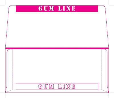
Here are a few samples to show you!

Fast, Easy, High Quality envelopes printed in full color at VERY AFFORDABLE PRICES!
We can show you how our E-Press!
can get your next direct mail project noticed!
Call us today! 336-275-8491

Tuesday, April 20, 2010

Make a Perfect Hi-res PDF from Quark

Good Morning my friends!

As promised, I will explain how to make the perfect high resolution pdf from quark.
Open your document in quark, next click the "FILE" tab at top, scroll down to "EXPORT", then to the right select "LAYOUT AS PDF". Ok, now decide where you want to save it, after that here are the settings:

Uncheck the Square box beside Spreads, make sure pages are set to ALL, next click the options tab: the first tab will be Layout info, skip this one, nothing you need to worry about here. Skip the Hyperlinks tab, go to the Job Options tab, check the Font Options boxes "Embed all fonts" and "Subset fonts below 35%".

Under the Compression Options: Make sure to set all tabs to NONE on the Compression tabs. Make sure to select keep resolution under all Resolution tabs. Make sure at the bottom to UNCHECK the compress text and Line Art box and UNCHECK the ASCII format box.


Next go to the "OUTPUT" tab under the color output section Type: Composite, under Print Colors: make sure to select As Is or CMYK, uncheck the produce blank pages unless you have blanks in the document. The use opi should be grayed out, under "REGISTRATION: select OFF tab, you do not want to include registrations in your file for the printers. Under BLEED select Symmetric and for the amount put "0.125" that is 1/8th of an inch bleed all the way around.


Next go to the "OPI" tab, and make sure to uncheck the OPI Active box, it will be grayed out. If this box is check and not grayed out, it will cause major problems when ripped and it will say images are missing. Then it will ask to go find them. A real pain.


So now you have a perfect PDF if your actual quark file it perfect! Have a great week! We have a new and exciting GREEN MACHINE, I will tell you about next week! ;-)


Wednesday, April 14, 2010

Crazy, wrong pdfs made from Quark!

Good Afternoon!

I received the craziest, just plain wrong pdf the other day. I know if you are a pre-press person you have to know what I am talking about. The weird thing is a PDF is supposed to be the perfect type of file to send to a printer.... not in this case. It really all depends on how the operator or designers save the pdf out of quark in order to get the perfect PDF to rip in our program (Rampage).

The file looked great on the screen, then all hell broke loose when I tried to rip the thing. It was a two color job but when I ripped it, it was 8, crazy. So I spent 3 hours trying to break the pdf file apart to make it work. It was honestly no fault of the designer, it was just the way the file was exported into a PDF.

I had to open the pdf in Acrobat and select the Advanced Edit photo tool then I selected each picture with the command and option keys, this opens the photo in photoshop so I could change it to a duotone instead of 4 color grayscale photos. Then I saved them and they automatically update in the PDF. There were about 12 or 14 photos I had to do that to. What a hot mess, I tend to think that I have no patience sometimes, but I actually have some when it comes to technical stuff. That is only if I can figure it out and make it work.

So to make a long story short it took 3 hours to break the pdf apart and make it work. Then we finally got the proof out... then along came changes, finally I got the parent quark files from the client and saved the pdf correctly and WOOHOO it worked.

Next week I am going to tell you the settings for a high res pdf in quark so you will save your company money. When it makes it to prepress department at your printers you will have an almost perfect or perfect pdf as long as the images and fonts are perfect too.

Have a great week and Enjoy the beautiful weather!

Tuesday, April 6, 2010

Types of Envelopes and Sizes


Good Morning!
Wow its going to be almost 90 degrees today in Greensboro. Kinda early for spring to be getting that hot already. Today I wanted to talk about Envelopes and different types and sizes.

There are usually 2 different types that are pretty common for invitations, reply cards, etc.
Type A is a square flap, Type Bar is a regular pointed flap. The type you choose is your preference. I personally like the A types for invitations. They just seem more formal. Even if your invite is not formal, it still looks great, especially if you print the return address on the flap.

Here is an example of an A-7 envelope:


Remember to place address or logos and or artwork 3/8th of an inch away from the edge. This is because when it is printed the press has to have room to grab the envelope, otherwise it may not print all of the image that you have placed on the envelope.

Here is an example of type Bar Envelopes:


See the difference in the flaps: Bar Envelopes and A envelopes come in many sizes, so I am going to list the sizes here. Just remember also when you design the card, invite, etc., be sure to make it at least 1/8th to 1/4 size smaller than the envelope. If you don't it will not fit the envelope.

Envelopes and Sizes:
A-2 (4 3/8 x 5 3/4) 4.375 x 5.75
A-6 (4 3/4 x 6 1/2) 4.75 x 6.5
A-7 (5 1/4 x 7 1/4) 5.25 x 7.25 (may require more postage)
A-8 (5 1/5 x 8 1/8) 5.5 x 8.125 (requires more postage)
A-9 (5 3/4 x 8 3/4) 5.75 x 8.75 (requires more postage)
A-10 (6 x 9 1/2) 6 x 9.5 (requires more postage)

4 Bar (3 5/8 x 5 1/8) 3.625 x 5.125
5 Bar (4 1/8 x 5 1/2) 4.125 x 5.5
5 1/2 Bar (4 3/8 x 5 3/4) 4.375 x 5.75
6 Bar (4 3/4 x 6 1/2) 4.75 x 6.5
Lee (5 1/4 x 7 1/4) 5.25 x 7.25 (may require more postage)

I am not sure why the Bar 7 envelope is called Lee, I will check on it and get back to you on that one. But if you already know the answer, please contact me and let me know, then I will post it on my blog!
Have a great Day and Week!
Nikki

Tuesday, March 30, 2010

Dielines for Envelopes


Good Afternoon!

What a beautiful day it is, and it will only get better through the week. Happy Easter! I hope everyone gets a day off for the holiday. We have Good Friday off, YAY!

Today I wanted to tell you a little about dielines for envelopes. To be more specific the Remittance envelopes. We have been doing a lot of those lately. It really helps me to lay the remittance envelope out if I have a dieline as a guide to follow.

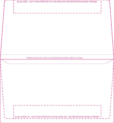
Because Remittance envelopes have glue tabs, you want to make sure that you don't put words on the bottom, or lines that need to be filled out. I didn't even realize until I saw someone design a remittance envelope one day with information to be check and filled in at the bottom of the inside. But when the person goes to fill it out and seals the envelope, it will rip the information off when the company goes to open it up. I am going to put a couple of sample of my remittance envelope dielines on here.

If you see one you could use please email me at graphics@clintonpress.com and request a dieline you need. I will be glad to send a vector eps Illustrator file to you. It will save you the hassle later on.

Here are a couple of samples of the most popular sizes we do a #9 Remittance and a #6 3/4 Remittance envelope:


Happy Easter! Feel Free to contact me if you need this dieline! Nikki

Monday, March 8, 2010

HOW TO MAKE PANTONE SWATCHES IN ILLUSTRATOR

Hey Everyone!
Finally beautiful weather, no snow and 60 degrees outside. Spring is on the way!
Today I am going to tell you how to use and make the Pantone swatches palette in Illustrator CS4.

After opening the Illustrator program: Go to the "Windows Tab" at the top, select the "Swatches Palette".

Next in the "Swatches Palette", select the arrow drop down menu on the right hand corner of the swatches palette. Choose: Open Swatch Library: then select Color books: then select the Pantone colors you wish to use, there are many choices. Pantone Solid Color is pretty standard in printing, but there are metallics, pastels and much much more.

Then the swatches show and you can type the pantone color you are looking for in the find field at the top of the pantone swatches palette. It will then take you directly to the color you wish to use.

Have a great day!

Friday, February 26, 2010

Imposition and Crop Marks

Okay friends,
Here is the definition of Imposition: Arrangement of pages on mechanicals or flats so they will appear in proper sequence after press sheets are folded and bound.

The reason I gave the definition is to let you know what it is that we do with your single page files. Clinton Press prefers single page layouts because we have to save and rip individual pages to Rampage, then Kathy my prepress expert imposes the pages to fit the way we print and fold and or stitch the job.

I have files sent in all the time in printer spreads and reader spreads. Also I get high resolution pdfs with crop marks, color bars, etc.

When you send in a file make sure it is set up in single pages in the document, also when you send in a pdf you will save time and money by including the bleed (1/8th of an inch .125") but please leave the crop marks and other stuff off.

I have to manually remove those before I rip it in rampage and give it to Kathy the Imposition and Proofing Specialist.

Hope this helps with the meaning of Imposition and why we ask for files in Single pages.

Thanks and Have a Great Weekend!